|
|

Posts: 786
Location: Minnesota | Thinking of making some customs. Any ideas?
My idea for a line of baits was to use contrasting colors. The baits would stand out but boy will they be ugly! LOL I am talking about using bright blue against orange and then maybe making some firetiger stripes in black to help define the edges of the bait (one example). Not going to make many but a few to see how they sell. My other idea is to make a few baits with certain conditions in mind. Either an overcast bait, full sun bait, stained water bait etc. etc. Anyone taken this approach in marketing their baits? I know many put out a variety of colors but how much do you guys put into marketing the baits or trying to tell the story of why a certain bait would work in certain conditions to those that may not know. I know when I first started I went after the "cool" looking baits and those work great but only some of the time.
Just curious on any thoughts.
Thanks,
James
PS-Post some pics of your baits if you have done this in the past. Don't worry, I already have about 30 color combos to work from  I am painting tomorrow, I will post some of my "clown" baits if I get a chance. I am painting tomorrow, I will post some of my "clown" baits if I get a chance.
Edited by Grunt Lures 3/12/2007 9:17 PM
|
|
| |
|
Posts: 1530
| ugly and contrast is very good. actually trolling a lure if its to real it will dis-apear in the water. we use some very different colors on st clair and one thing,,, contrast is huge |
|
| |
|

Posts: 786
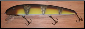
Location: Minnesota | Thanks woodie! Here are a few I did today. The rights one is the most contrast. Going to do a few more this week that are real ugly. Also did a new one in bronze for some stained lakes. Calling it "The Spartan" Grunt. Always hear if you lure disapears in the water that is a good thing too  Waconia is green green green after a month or two andI have not had much luck using green lures on that lake so I am not convinced yet Waconia is green green green after a month or two andI have not had much luck using green lures on that lake so I am not convinced yet  The guys on TV say so though.... The guys on TV say so though....
James
PS-These still look a little dull. They don't have any clear coats on them yet.
PSS-If "Mr. Rapala" reads this, thanks for the color schemes. LOL Yes, I got some of the ideas from my Cabelas catalog in the bass lure section.
Edited by Grunt Lures 3/13/2007 9:02 PM
Attachments
----------------
 Picture1.jpg (20KB - 138 downloads) Picture1.jpg (20KB - 138 downloads)
|
|
| |
|

Posts: 61
Location: Hyvinkää, Finland, Europe | Here's one of my favourite "contrast color" called F.Nega(-tive):
http://img.photobucket.com/albums/v489/Jio/Fat-Tfnega.jpg
and it's very atractive too:
http://img.photobucket.com/albums/v489/Jio/Koivistonvajaaseiska.jpg
Edited by Jio 3/14/2007 12:52 AM
|
|
| |
|
Posts: 1530
| 3rd from left HOT. bolder the bars the better. olive green waters make the body color dis-appear but the bars or dots brite. thats the trigger in pea green here. |
|
| |
|

Posts: 786
Location: Minnesota | Woodie,
I am going to make the "Spartan" with a red/silver under the black scales next. I thought it needed something extra under the scales to set it off too.
BTW-Just saw the movie 300 last night and it has only inspired me to make more "warrior" class baits  Got one I am going to call "Blue Steel". It is about half way done and then I am going to start on the "Samurai". Love some of the Samurai battle uniforms I have seen in museum and on the net. Very flashy and a lot of contrast. Got one I am going to call "Blue Steel". It is about half way done and then I am going to start on the "Samurai". Love some of the Samurai battle uniforms I have seen in museum and on the net. Very flashy and a lot of contrast.
Making some customs definitely breaks up the monotony of making the same bait colors over and over again....
James
Edited by Grunt Lures 3/14/2007 10:18 AM
Attachments
----------------
 samurai.gif (41KB - 137 downloads) samurai.gif (41KB - 137 downloads)
|
|
| |
|
| James, if you want contrast, do a search for "Color Wheel".
It will show you which colors compliment one another, and also show you which colors are the best to use for contrast.
Like blue against orange or vice versa.
I have a color wheel that I printed from the net hanging in the garage.
Sometimes it gives you ideas that you'd never guess on your own. It's also just fun to look at and play with some of the more elaborate ones and can help you to blend colors to come up with colors that don't come right out of the bottle.
I believe contrast is the key. If the lure is easier to see, I believe it is more likely to get looked at. Matching the hatch can be good, but real fish look the way that they do for a reason....camoflauge. Sometimes just adding one spot of color in the right place can make a difference.
Good looking stuff.
Beav |
|
| |
|

Posts: 786
Location: Minnesota | Thanks Beaver. Funny thing is, I already have the color wheel in the shop on the wall. Some interesting color combos there. A lot of football teams use contrasting colors. Maybe just make football lures. LOL |
|
| |
|

Posts: 87
| 300 looks like an AMAZING MOVIE |
|
| |
 Bait color question for the builders
 Bait color question for the builders